
Introduction
Learning to design is learning to see, is a quote from one of the earliest readings in the course and it perfectly encapsulates the essence of the design process. Of course I can see. I see screens, sticky notes, Figma frames and physical prototypes. Yet, as the course went on, I started to understand that most of what I was seeing was really my own assumptions reflected back at me.
As developers, we often become deeply familiar with the systems we build. While this familiarity can be an asset, it can also become a limitation. Domain knowledge can unintentionally filter out user confusion, frustration, and need, leading us to design for what makes sense to us rather than what works for others. Learning to design, then, requires learning to step outside of our own perspective and intentionally adopt the viewpoint of the user.
Throughout this journey in Human Computer Interaction, I practiced this shift across multiple contexts, from redesigning digital interfaces to building physical and immersive prototypes. As I engaged with each project, several lessons were picked up and recurring. These helped reshape how I think about building things and led me to a set of core principles that will continue to guide my approach to design beyond this class.
1. Lead with empathy
Leading with empathy is learning to see to see put into practice. Throughout the course, I have been called to step into the user's shoes and immerse myself in the user's context with the hope of distilling their often emotional reactions, frustrations and motivations into clear actionable and implementable design steps. The approaches range from observation, surveying, secondary research and interviewing, and tries to understand the What, How and Why behind the user experience.
In Design Sprint 4, empathy showed up most clearly through the interviews we conducted while evaluating the redesigned prototype. Before making any design decisions, we spent time speaking with classmates who represented different types of users and gathered real reactions to the existing Design for Dimensions prototype. These interviews helped us understand where users felt confused, overwhelmed, or disengaged. Participants shared what felt intuitive, what felt frustrating, and what they wished the system allowed them to do. Through the exercise, I learned empathy is about moving beyond surface level insight, to instead using user struggles and motivations to unlock a deeper understanding as you work towards designing a solution.
2. Narrow down your focus
Having spent time understanding the problem from the user perspective, you still face a reality that most problems are layered and complicated. No single design solves everything. Defining the problem statement becomes the moment when you choose a specific goal and let go of the rest. As Amy Ko puts it in How to define problems, Different designs may serve different goals, and so understanding the space of goals that you might design for is critical. The problem statement is there to define the specific problem you want to solve and guide the rest of the process.
An equally valuable exercise in narrowing the focus is the building out personas, which are fictional characters that are described out in detail to represent the real users people you might design for, and scenarios, which capture what a person might attempt to do with something you design. Together, these work together they anchor the work in reality rather than abstraction.
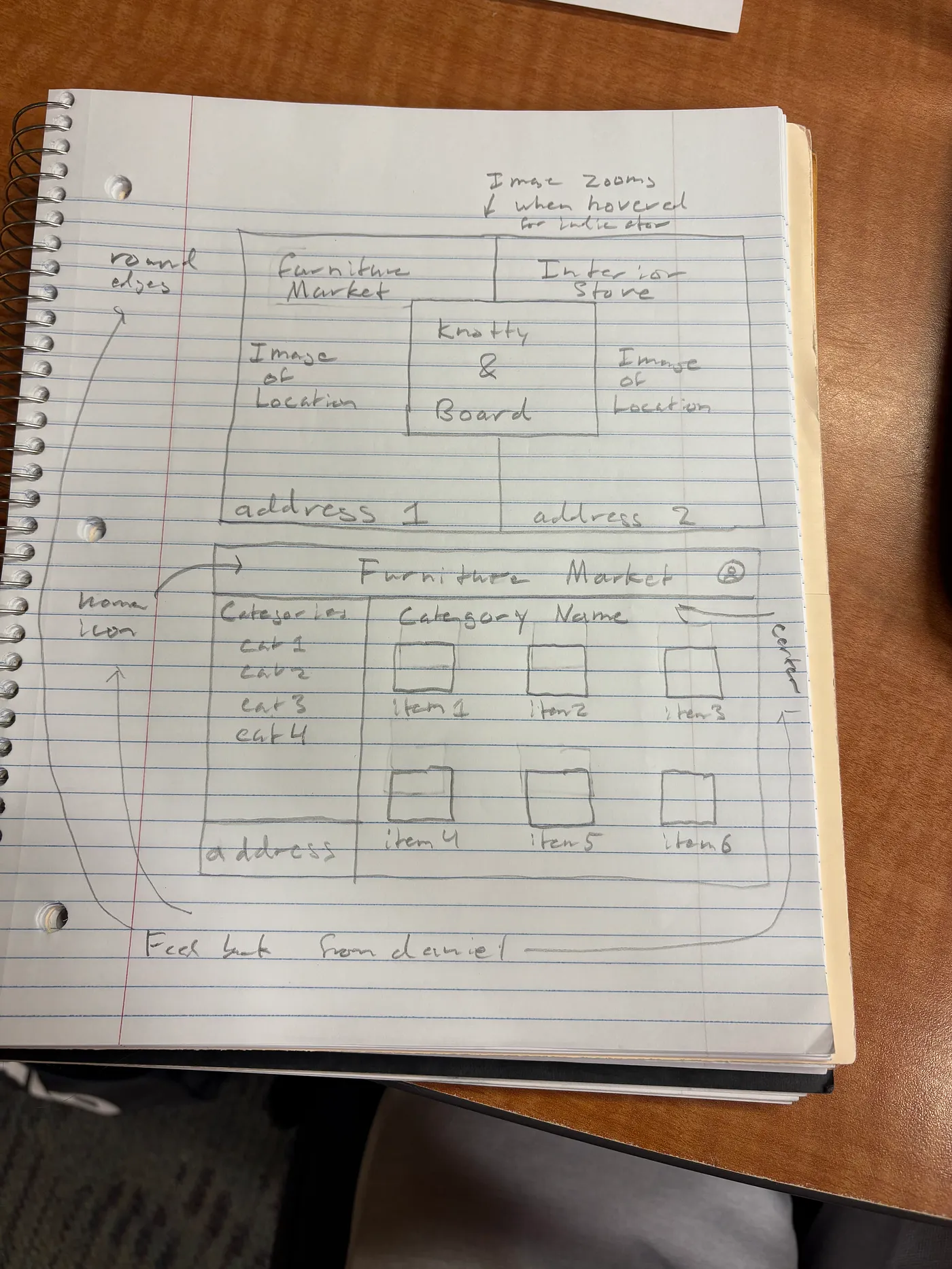
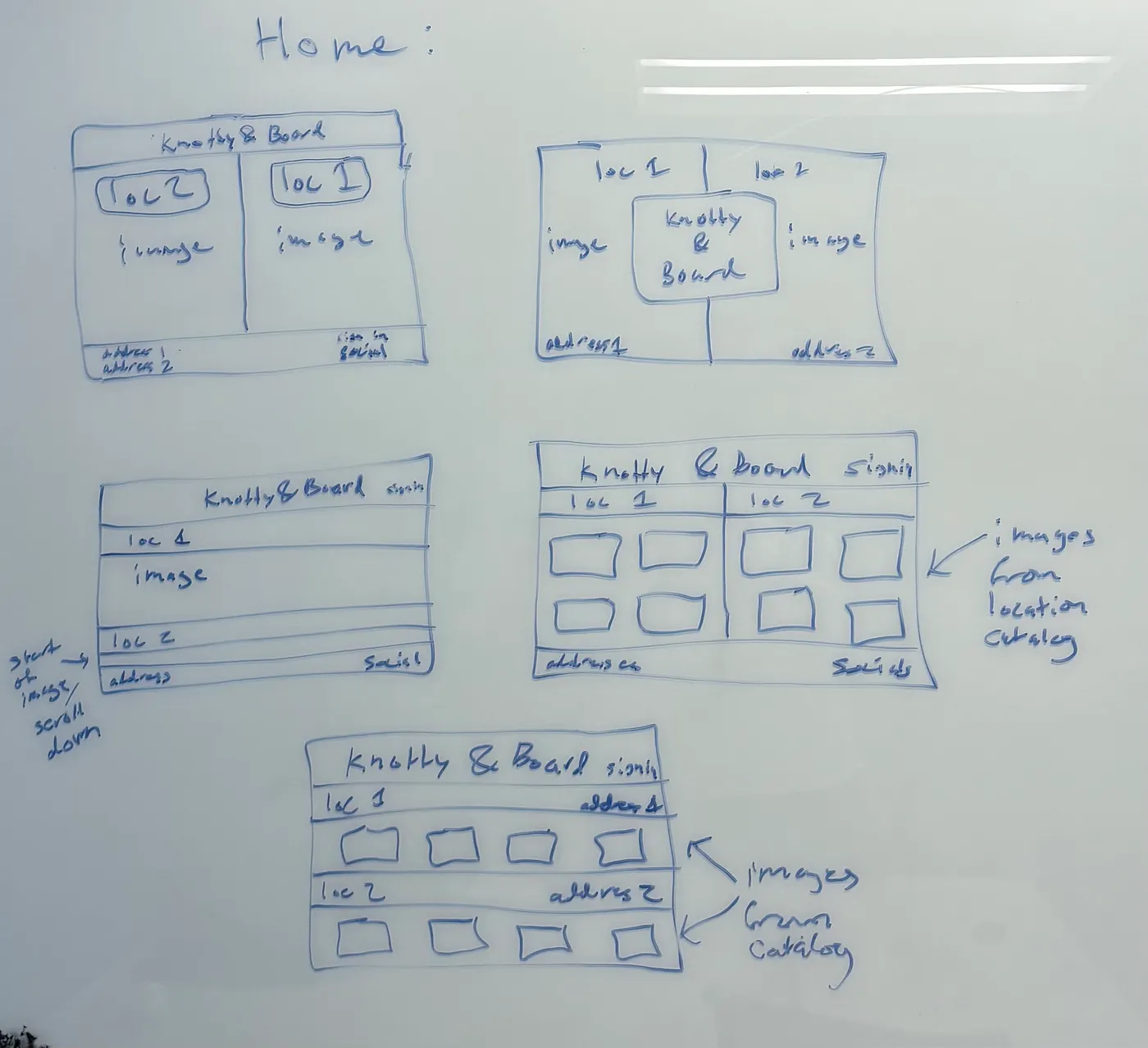
This was put into practice in Design Sprint 1 as we worked to redesign Knotty and Board's website, by building out two personas. The first was a young couple, Maya and Jordan, who were preparing for their first family home and needed an affordable and intuitive way to browse essential furniture. The second was Ellen and Robert, empty nesters seeking high quality pieces that reflected their personal style. These personas immediately clarified the goals and limitations of our redesign. They also helped surface the trade offs we needed to make. Using them, we built scenarios that imagined how each group would arrive on the site, what they would hope to accomplish, and what obstacles might get in their way. These scenarios shaped everything from the navigation structure to the placement of product information
3. Iterate, iterate, iterate
Iteration is the part of the process I used to underestimate. I often wanted to jump straight to building the final version of an idea. However, as Amy Ko points out in How to prototype, the process of building is both time and resource intensive, so by instead building iteratively we make sure resources are efficiently used and directed to the right issues. Start with the simplest possible version. Sketch something. Test it. Learn from what breaks or confuses the user. Let the feedback shape the next version. This prevents you from traveling too far down the wrong path and misallocating resources.
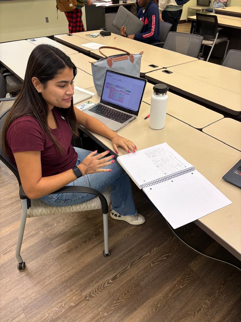
Iteration was particularly stressed in Design Sprint 2 (Design for Understanding) where we worked through the 5 design sheet process as we built out data visualizations. By repeatedly sketching and revisiting ideas for data visualizations, we benefited from feedback and were able to make the necessary changes before locking ourselves into a single concept too early. Similarly, in Design Sprint 4 continued this pattern, by building on top of feedback from Design Sprint 1 as we worked to build a physical prototype for Knotty and Board. We began with rough sketches to explore how interactions might translate into a tangible form, then developed paper prototypes to make those ideas testable. Through usability evaluations, we identified breakdowns in navigation, clarity, and organization. Even during the live demo in class, there were insights gained to help improve the next version of our prototype demonstrating how the iterative process is continuous.
4. Accessibility and Ethics are priorities not after thoughts
It is surprisingly easy to design only for people who look like you, think like you, or move like you. Too often as we build solutions, accessibility is an after thought that is considered at the end of the design process. Yet repeatedly, our discussions and readings reminded us to look beyond ourselves and consider how we may accommodate people with different bodies, abilities, and contexts so that all users have the same experience. We learned about Universal Design and how to shift accessibility from being a feature at the end to a mindset that guides the entire design process. This was particularly evident during Design Sprint 4, when feedback revealed that the narrow physical construction of our prototype made it difficult for some users to interact with the miniature furniture models. This limitation exposed how physical dimensions, reach, and modality can unintentionally exclude users if accessibility is not considered early. And these considerations would inform a future iteration of our product.
Similarly, in a field such as HCI that deals so closely with humans, it is crucial that there are broader ethical considerations of how our work affects the individuals involved. When testing a prototype and requesting feedback which was a part of all the Design Sprints, we worked to make sure participants were consenting, well aware of what they were signing up for and that we were compliant with both Davidson's Institutional Review Board policy and best practice practices laid out in the Belmont Report. Further, these considerations were evident within the teams we worked in as we decided whether or not to publish our work.
5. Be open to change
Throughout this course, I learned that openness to change is not a weakness in the design process but a practical necessity. Initial visions often collide with the realities of time, tools, and technical constraints. Ideas that seem feasible in theory reveal hidden complexity. Technologies that appear powerful on paper expose limitations once you begin building.
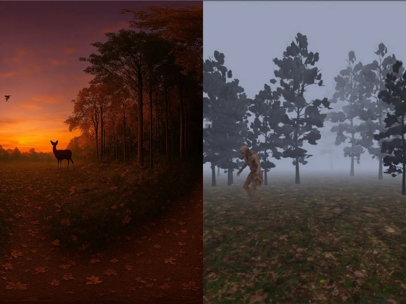
This became especially clear in Design Sprint 3 as our team developed a VR experience in A-frame. We began with an ambitious concept for a fully immersive 3D haunted environment, complete with spatial movement and interactive elements. However, as we engaged with A-frame, it became obvious that our technical unfamiliarity and the project timeline made this vision unrealistic. Rather than forcing the original idea, we pivoted to a 2D experience built from panoramic images that still created the atmosphere we wanted while remaining feasible to implement. The shift was not simply a compromise. It was an example of adapting the vision to align with constraints and user experience goals. Letting go of the initial plan allowed us to design something coherent, achievable, and still engaging.
Conclusion
Learning to design is learning to see. It is learning to see users more clearly, problems more honestly, and your own assumptions more critically. Through empathy, focus, iteration, accessibility, and adaptability, I learned how much design is less about the artifact and more about the mindset that shapes it.
This course changed how I approach building things. It taught me to slow down, pay attention, ask better questions, and trust the process. Most importantly, it reminded me that design is ultimately about people and the experiences we create for them.